

digital design • print design • Merchandising design• Product Branding • Brand Identity
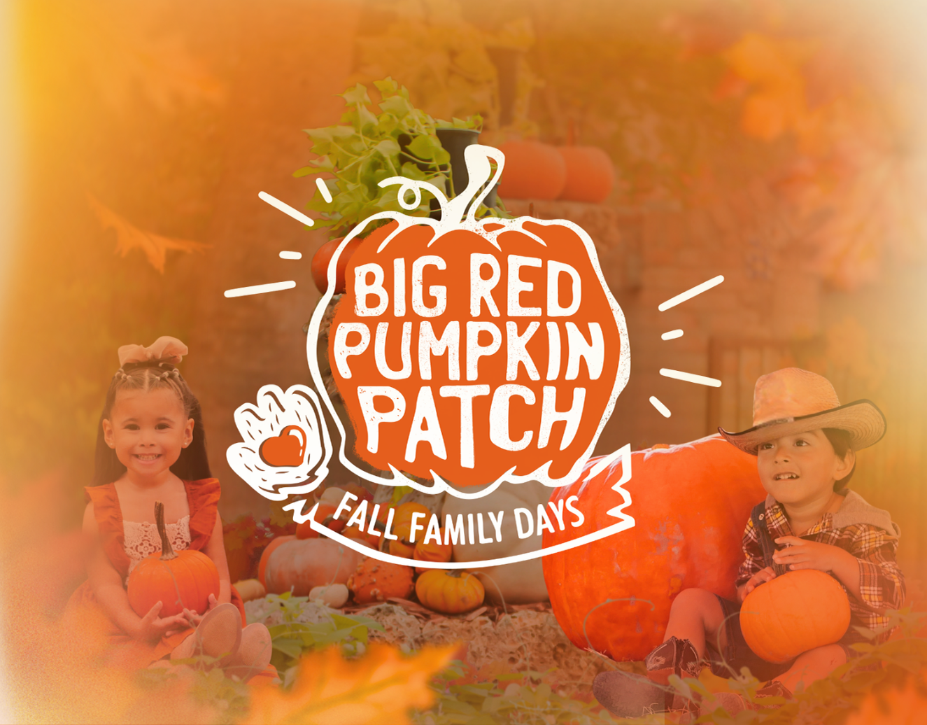
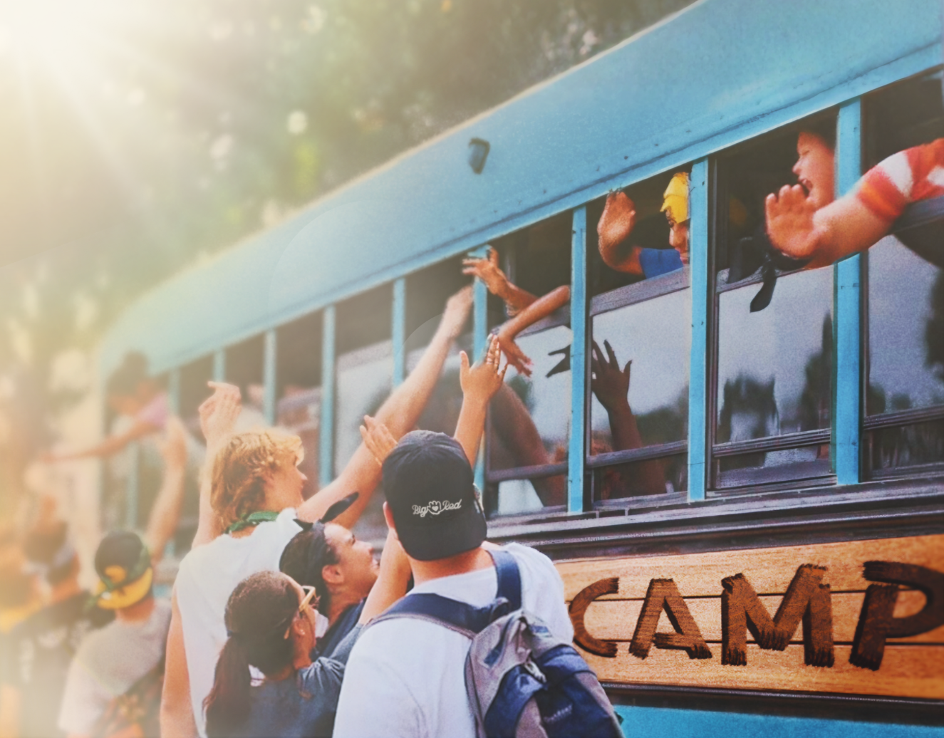
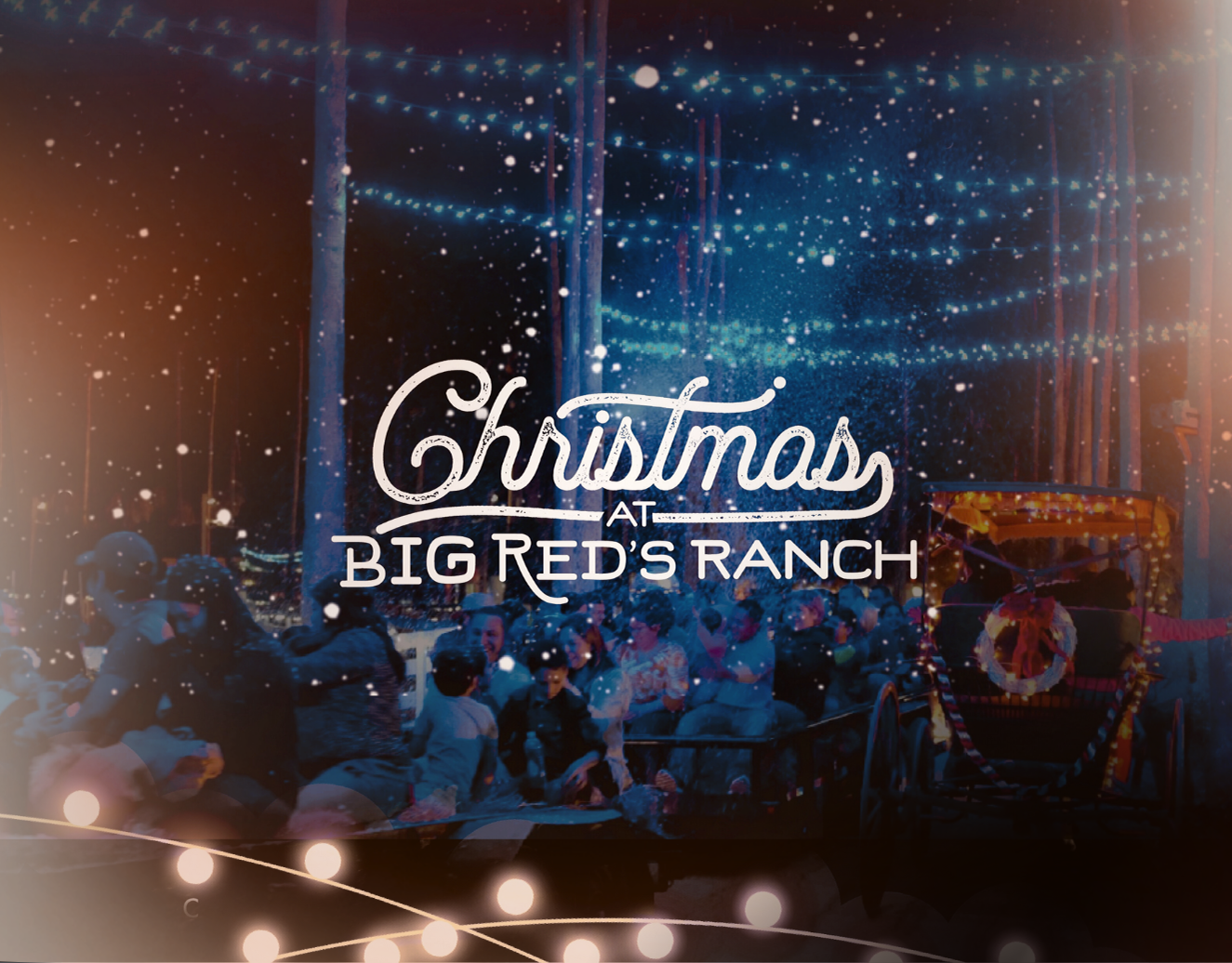
Big Red’s Ranch is a family-oriented nonprofit that hosts seasonal events and kids camps designed to inspire community, creativity, and outdoor adventure. My role as a graphic designer was to evolve the existing brand identity into a flexible, unified system that captured the ranch’s playful, family-friendly spirit across merchandise, signage, print, and digital media.
Original brand identity system and mascot

The original logo, graphics, and mascot design were created by Jake Nguyen in 2015. The goal of my visual exploration was to build upon this foundation by refreshing, expanding, and unifying the various visual styles into a cohesive system of icons and logomarks. Through this process, I developed an updated suite of branding assets that maintained the charm of the original mascot while giving the identity more versatility for modern applications. This included designing scalable marks for use across digital and print, refining the typography, and introducing a simplified icon set that could adapt to everything from small-scale enamel pins to large outdoor signage.
my exploration of Brand identity and iconography
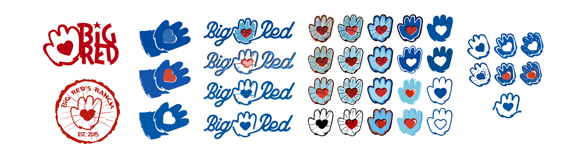
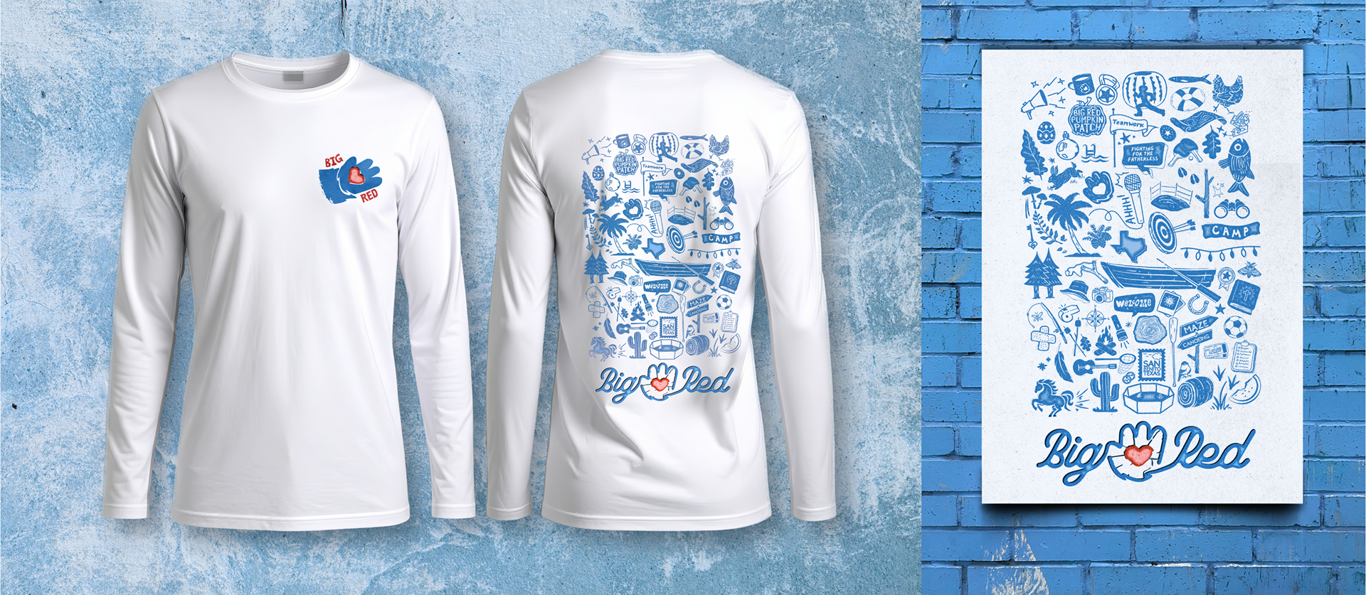
I refreshed the Big Red’s Ranch logo system and developed a expanded visual library of icons and submarks inspired by camp life, family fun, and the ranch’s spirit of adventure. Each icon was designed to work both individually and as part of a pattern system, allowing the visuals to be mixed and matched across merchandise, print materials, and digital content. The goal was to create a design language that felt bright, friendly, and full of energy, something kids and adults alike could connect with and remember.
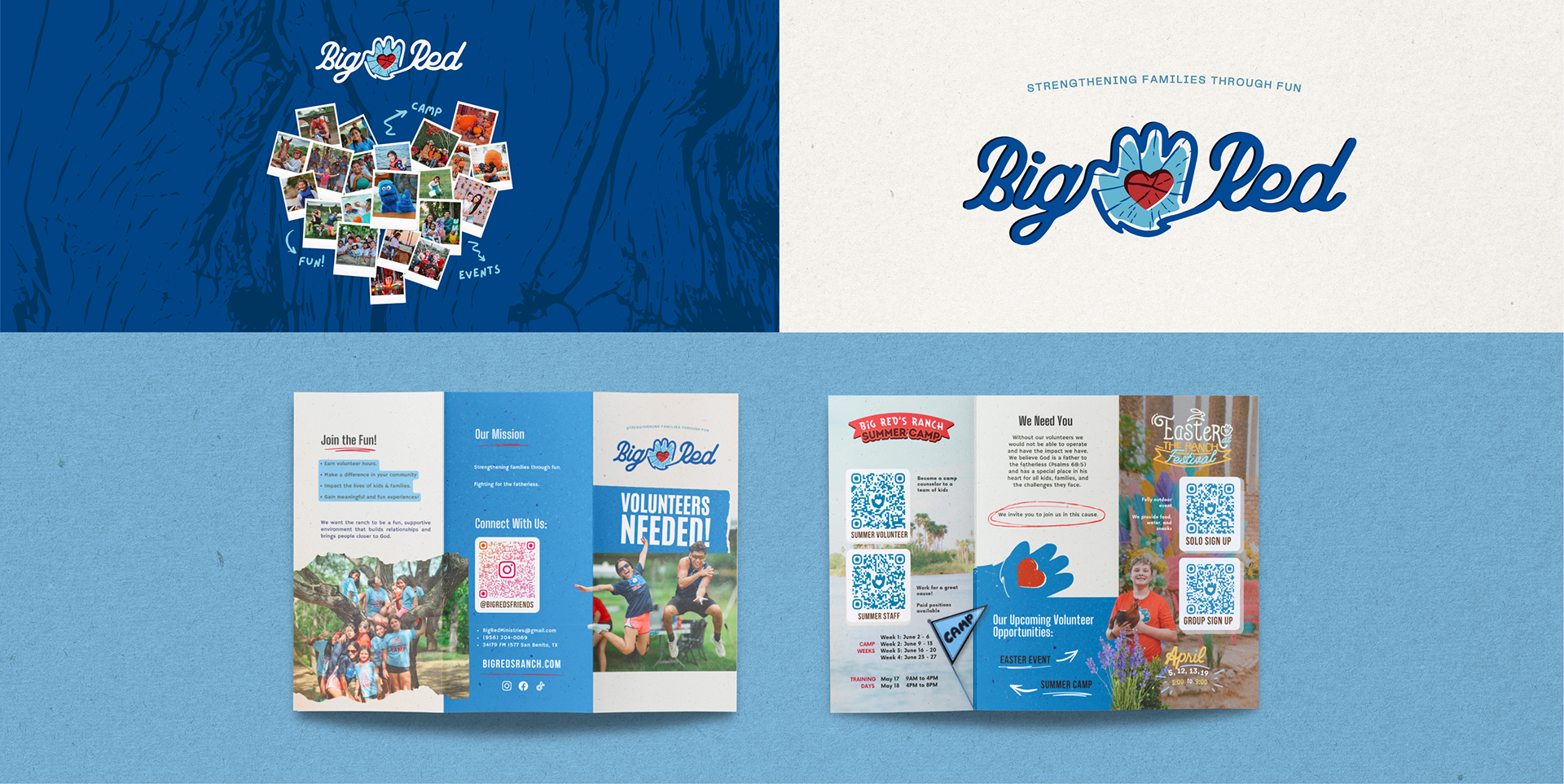
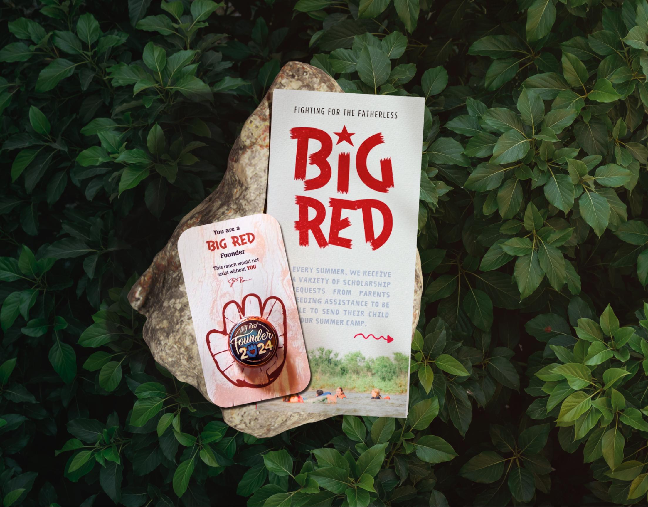
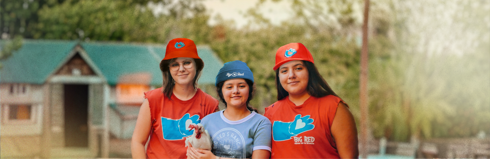
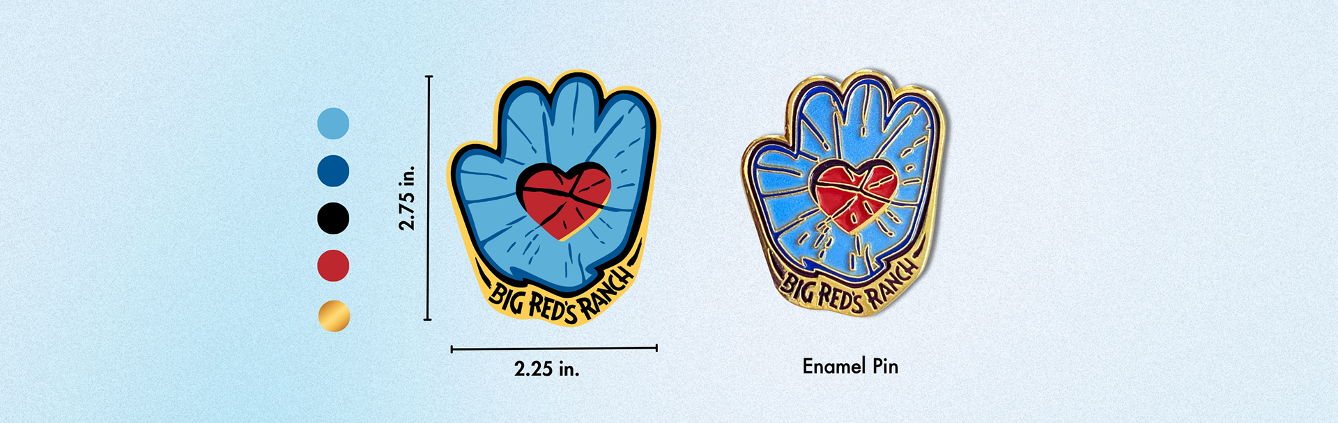
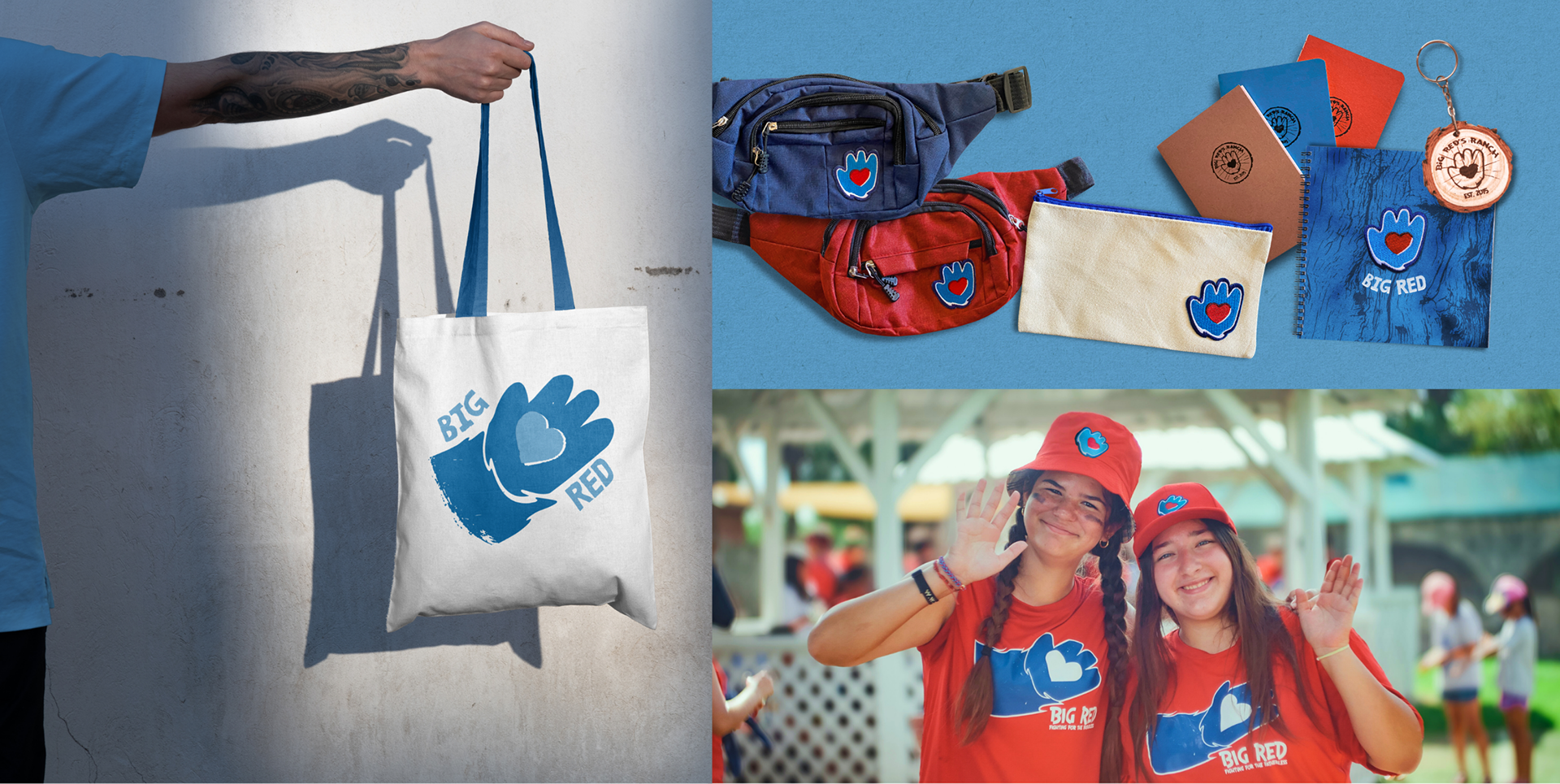
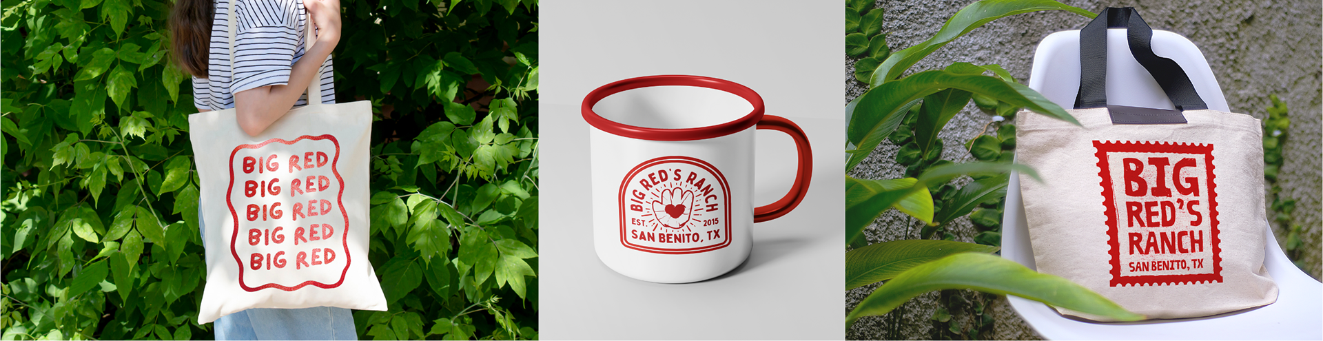
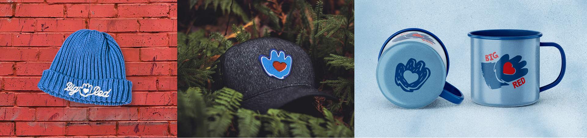
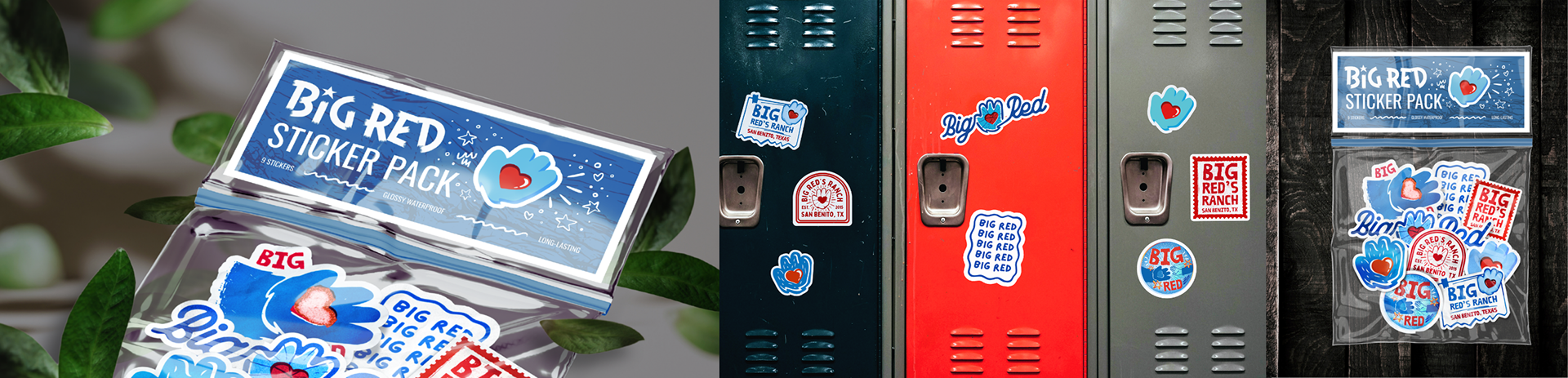
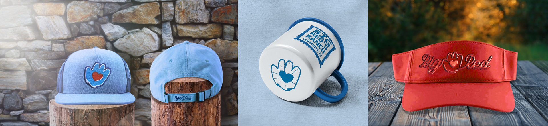
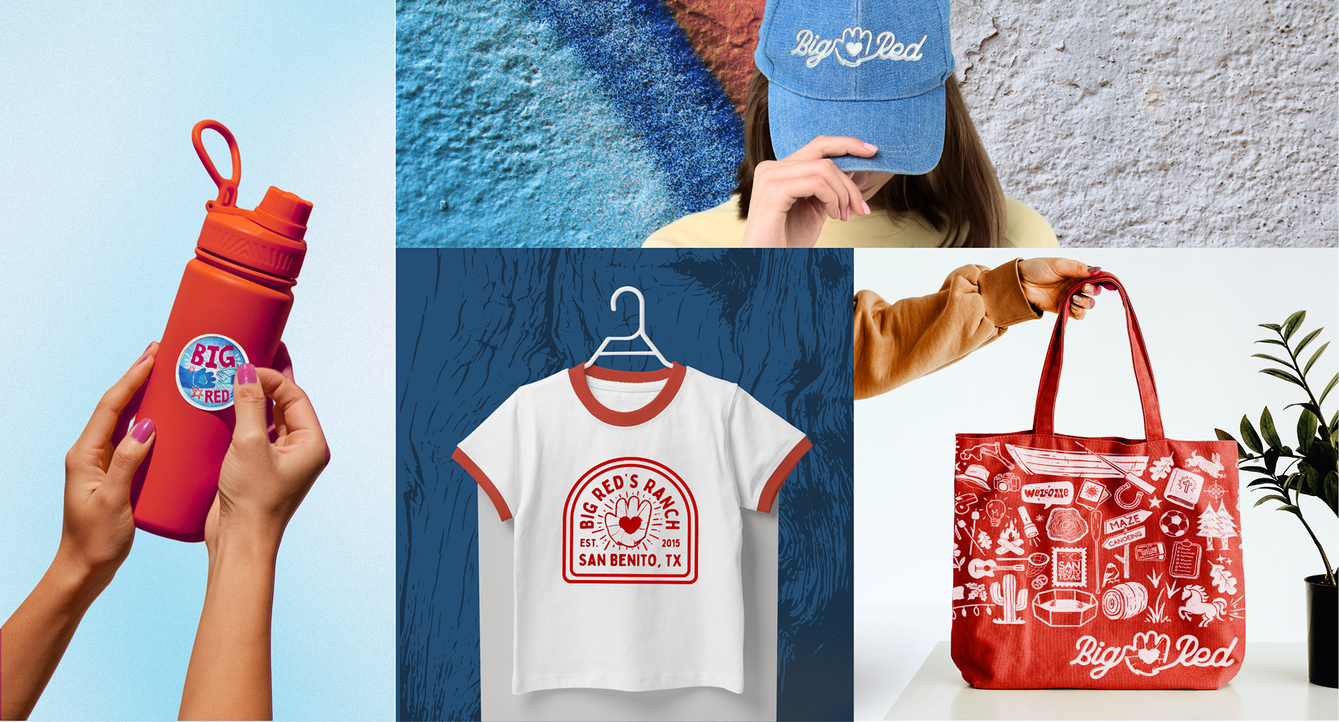
The refreshed brand identity came to life through an extensive line of merchandise and printed materials designed for both guests, campers, and staff. I developed concepts for apparel, tote bags, mugs, hats, stickers, enamel pins, notebooks, and volunteer brochures, all unified through consistent color, typography, and iconography. Each item was designed to feel like a collectible piece of the ranch experience, balancing practicality with charm.
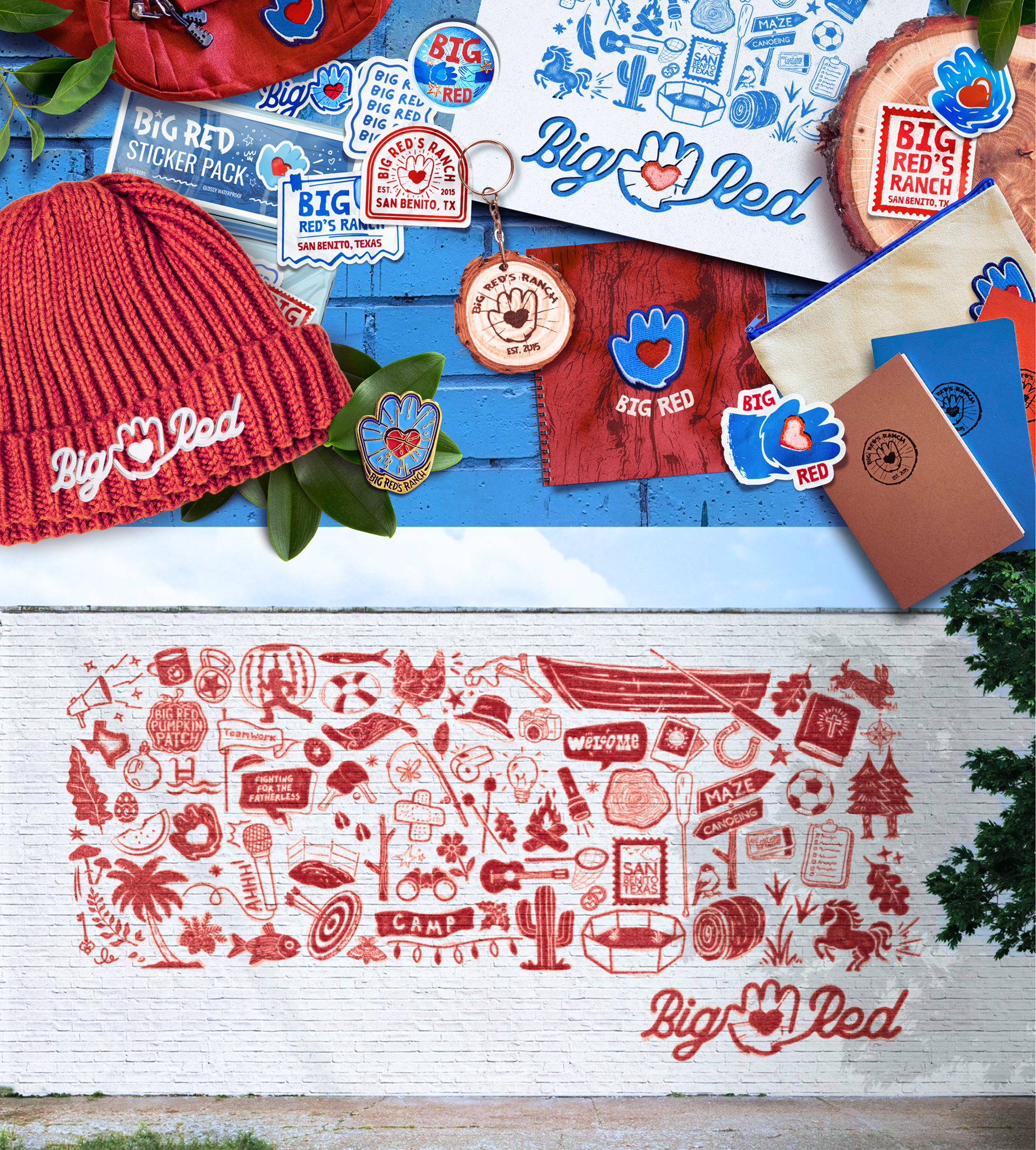
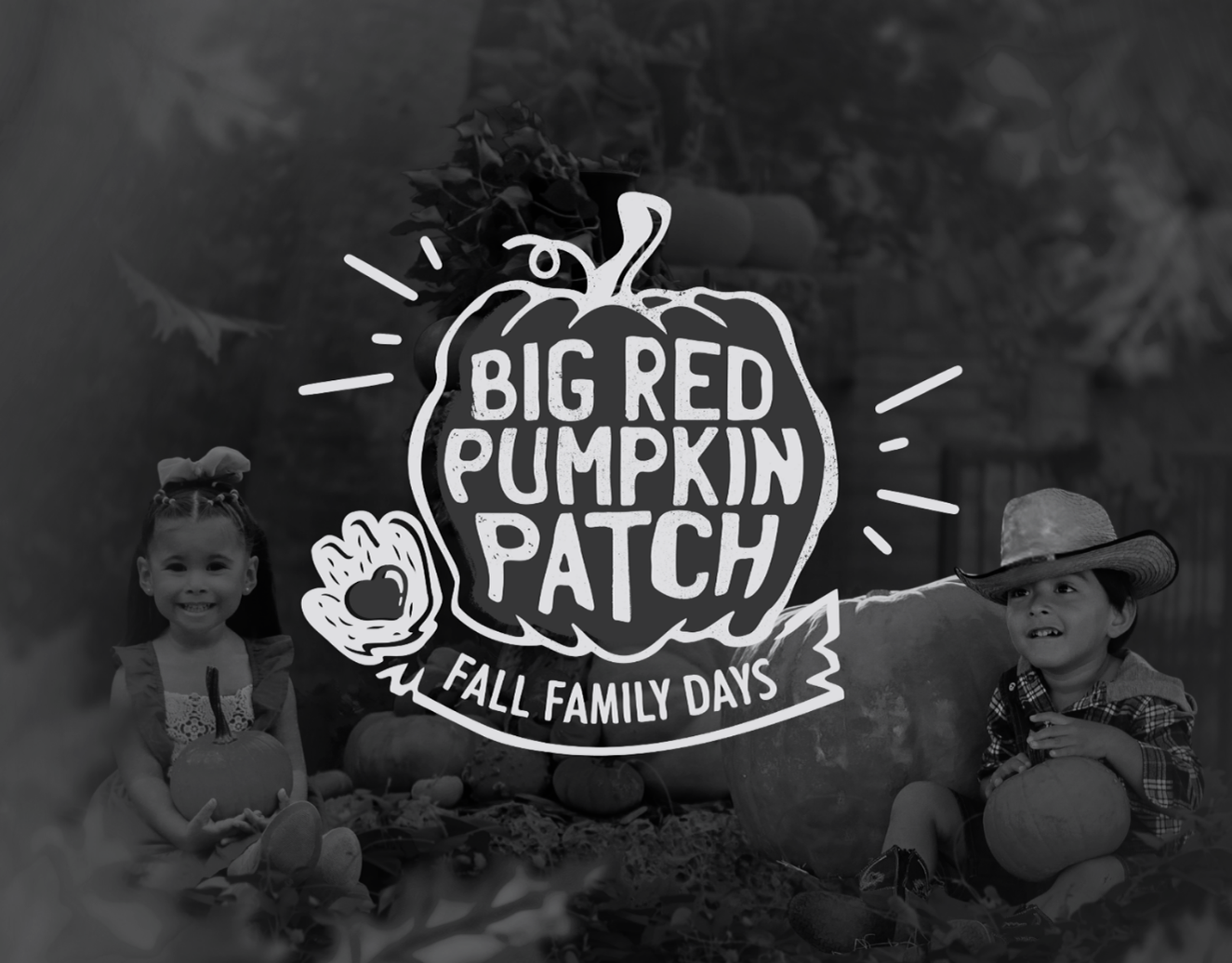
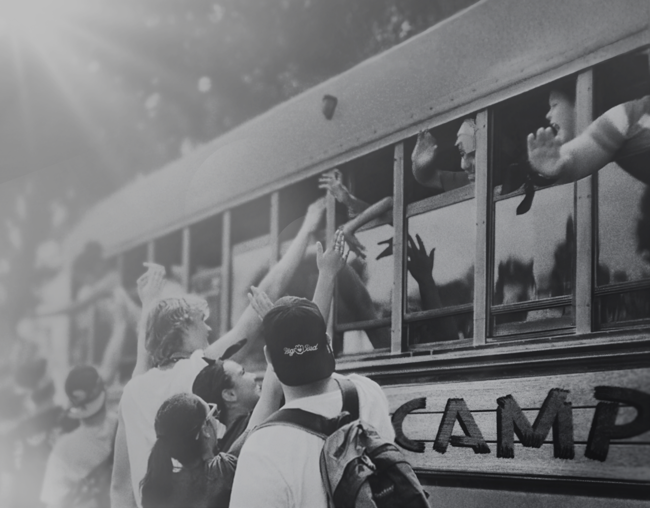
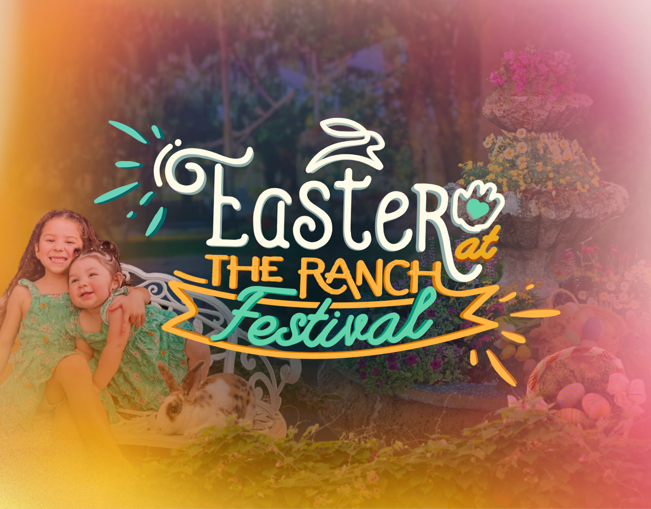
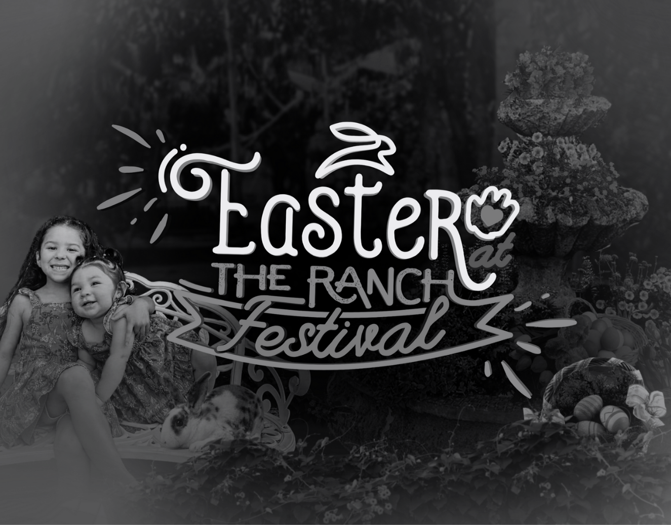
Beyond merchandise, the brand system extended into print collateral and environmental design, such as this large-scale mural illustration that visually ties together the ranch’s primary events: the Pumpkin Patch, Christmas Festival, Easter Event, and Summer Camps.
Through this design refresh, Big Red’s Ranch gained a more unified and recognizable identity across events and platforms. This expanded visual system strengthened brand recognition and made it easier to create new materials for future events